A brand with meaning.
JioSaavn – Brand 2.0
Brand Guides
Behind the Brand
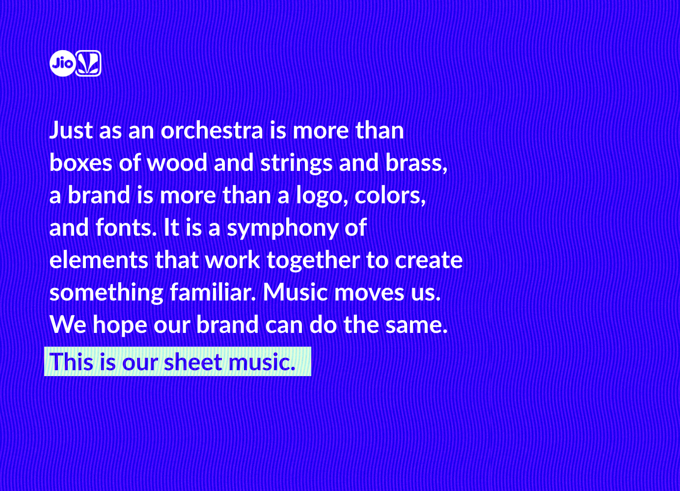
A brand is more than a logo, colors, and fonts. It is a symphony of elements that work together to create something familiar.
Role
Design Conception & Lead
Working alongside our marketing team and organization executives, we created a recognizable brand that means something. Music is moving. We wanted our brand to reflect that.
Mission
A Brand with Meaning
A re-brand is simple enough. Make things look pretty within some defined structure. We weren’t interested in that.
Our goal was to create a brand with real meaning behind it, so that every creative that we put out was not only undoubtably JioSaavn, but encompassed a deeper meaning.
The question became, how do we do this – create some set of visual rules that forms a deeper connection to music, and therefore, our audience?
Approach
The Meat & Potatoes
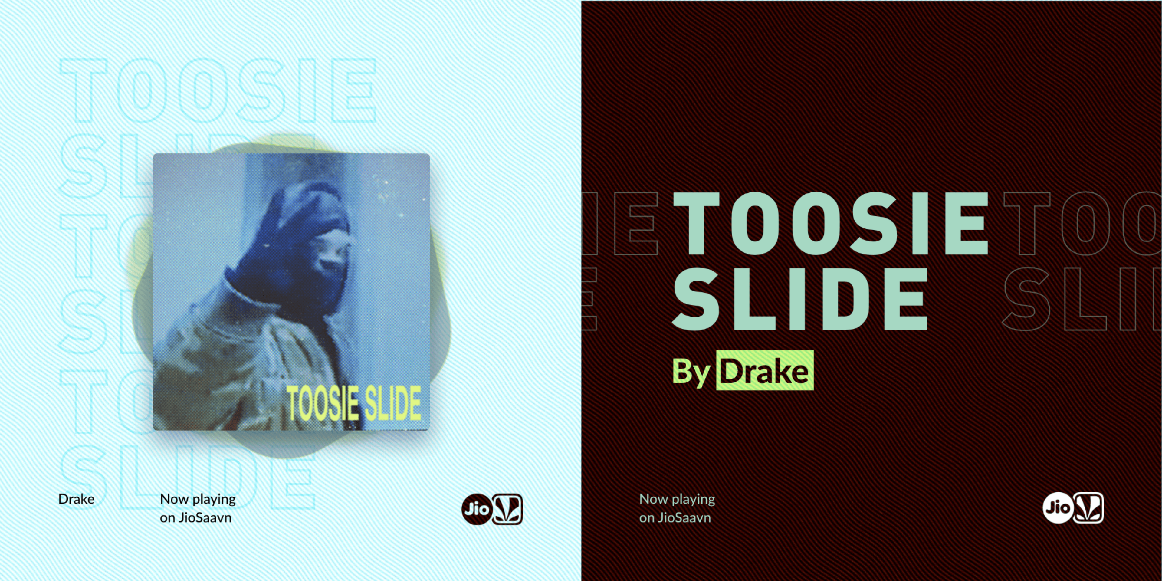
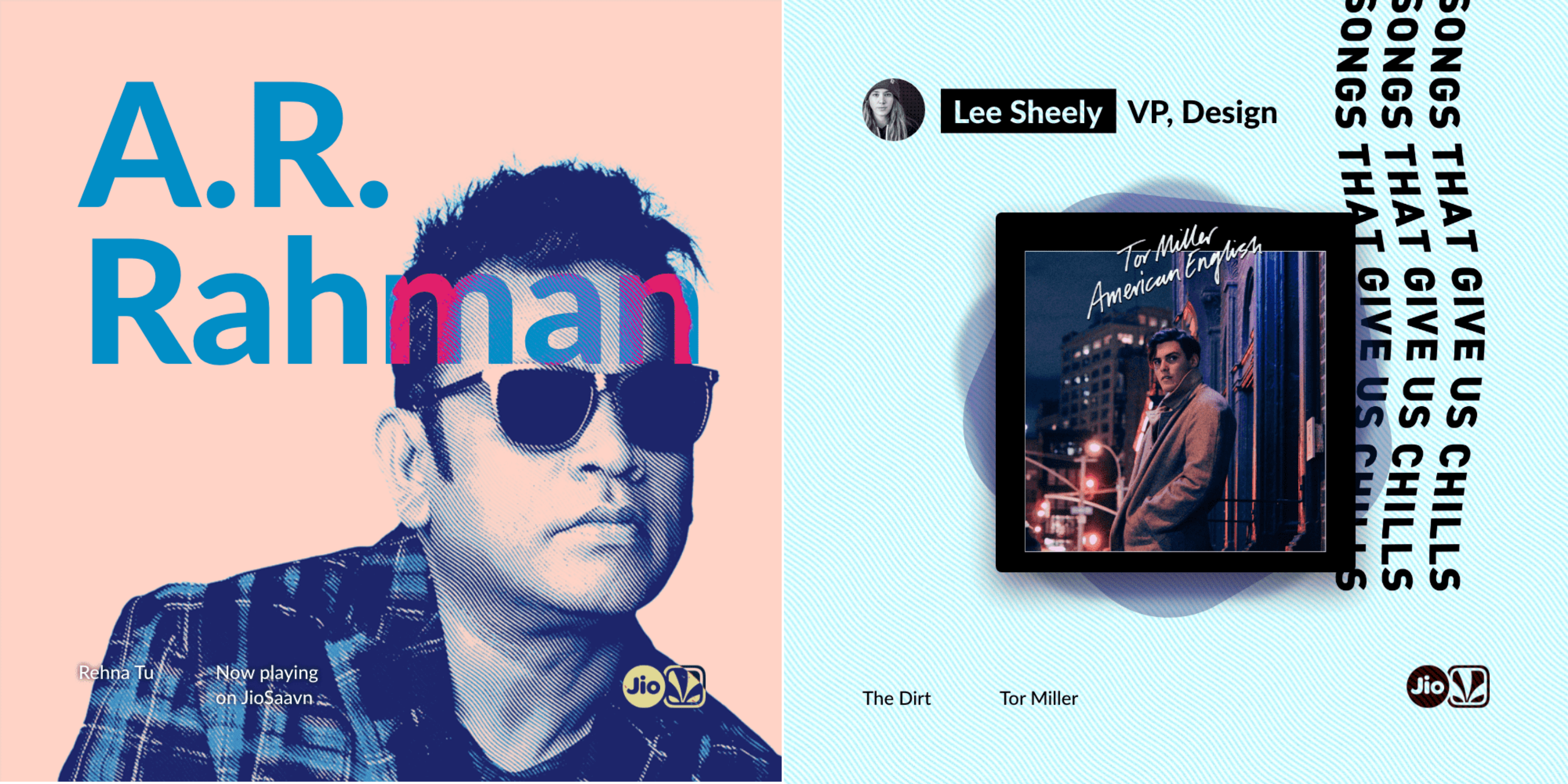
The JioSaavn 2.0 brand is built around a direct visualization of goosebumps. It is a modular system that is flexible and identifiable. At the core of the system is a wave element, and many others that stem from the same concept, as the most basic building block to our brand. It symbolizes anything from sound waves, to movement, to goosebumps.

When it came to identifying a particular color palette, we decided to steer away from a set of specific guidelines.
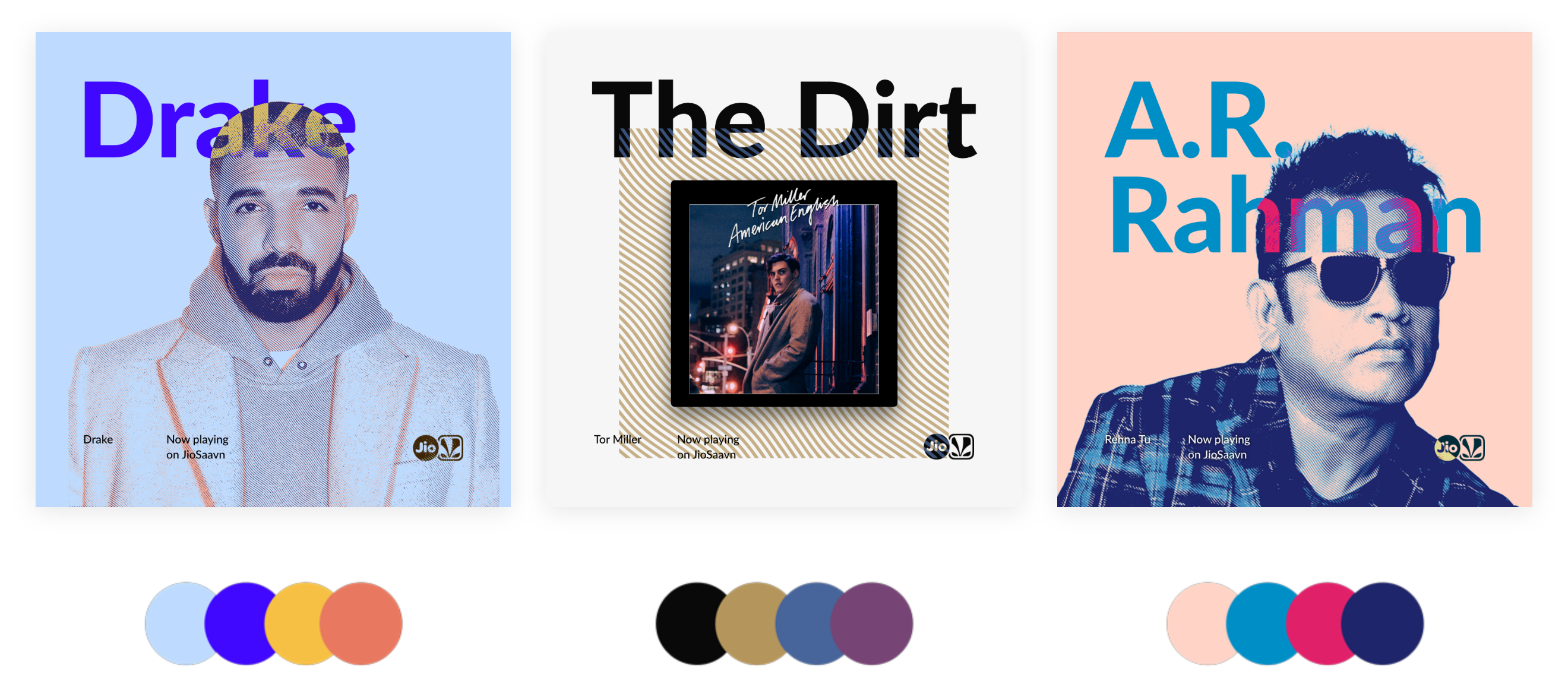
The color of a creative sets its’ tone and mood. While the ethos of the brand should be fun, bright and bold, rather than setting a static usable palette, creatives should use color appropriate for its context.
Colors used should represent genre, style, and compatibility with other established palettes already present.
There are two main styles that should be used on photography within the JioSaavn brand:
- Polygon Portraits
- Motion Halftone
The process of creating a polygon starts with a photo. Creating the illustration is a result of many polygonal shapes (no curves) drawn so that each shape connects to the next. The result is a vector illustration that should strike an easily recognizable likeness to its’ reference image. Because they are vector, these can be used at any proportional size, and are great for print especially.
The motion halftone effect uses a wave pattern as a halftone over an image, and uses color similar to the way albums used to be printed in halftone dots. It brings an element of visual interest to a photo, while incorporating a nostalgic purpose and familiarity.
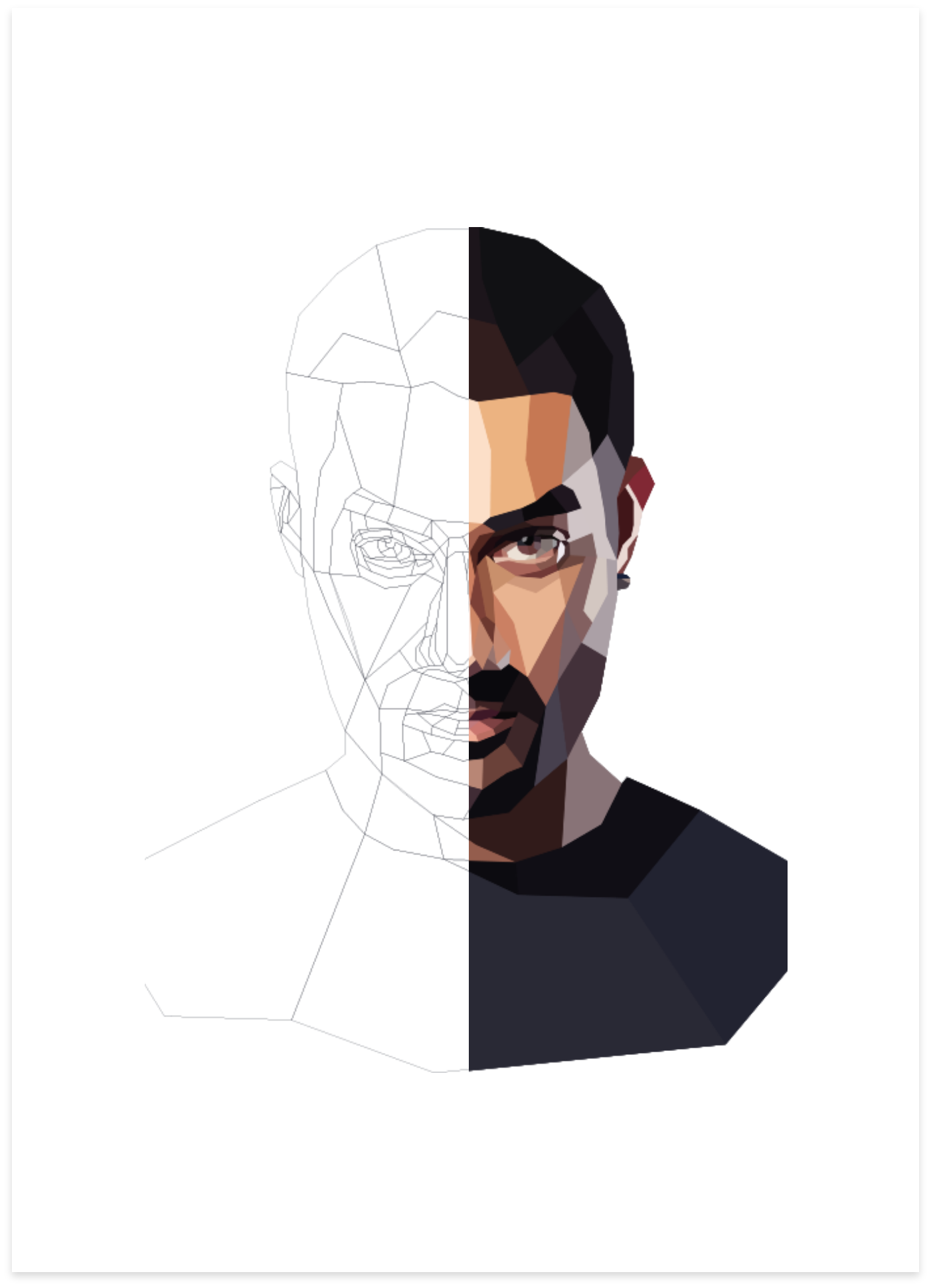
Polygon Portrait
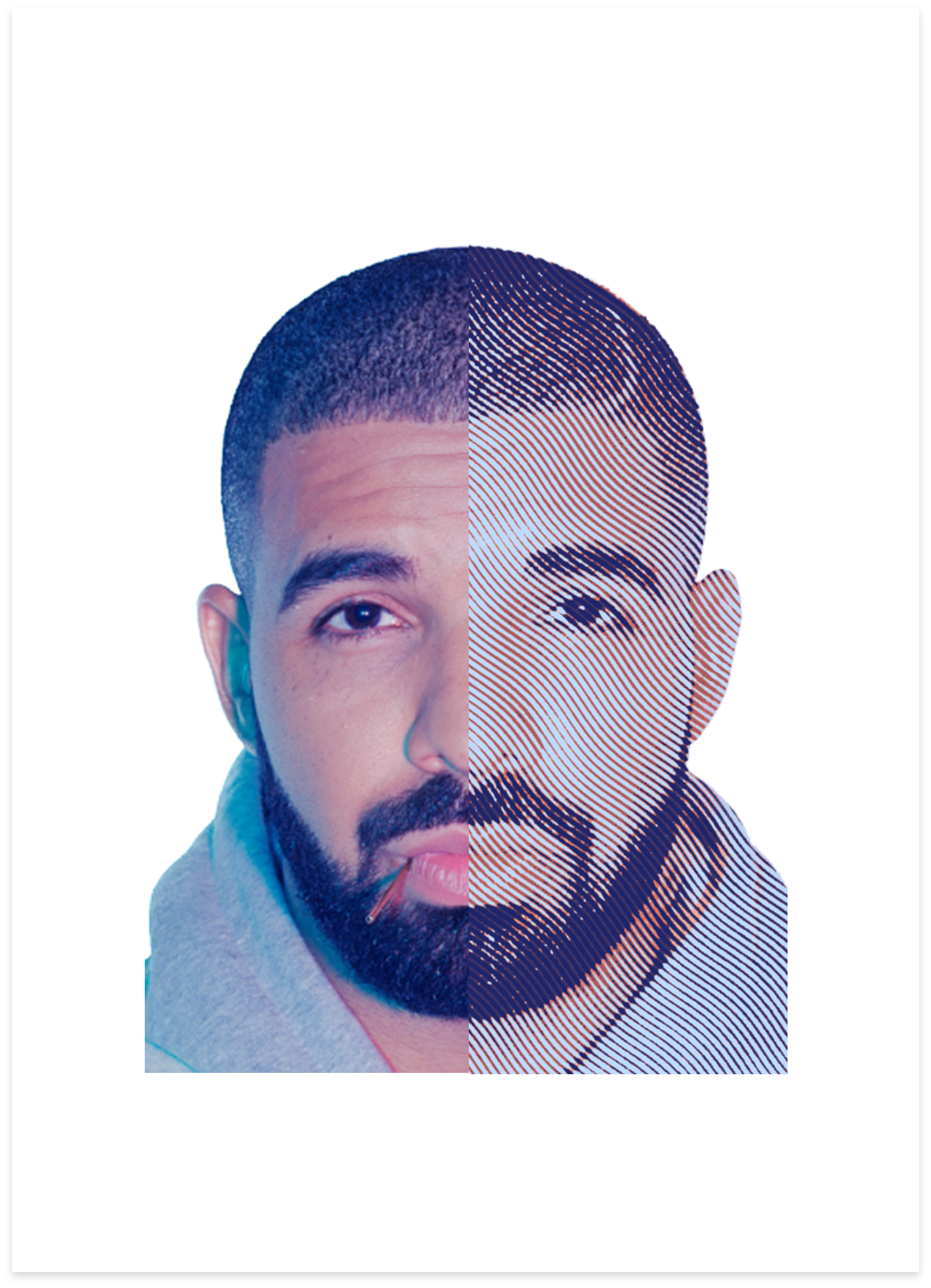
Motion Halftone
A collection of elements, including the ones featured below, build the JioSaavn brand. Elements can be layered together or individually to bring interest and familiarity to creatives.

Credits
A Labor of Brand Love
VP of Design:
Leeann Sheely
Creative Direcor, Brand & Content:
Mark Graybill
Creative Director, Graphics:
Doug Davala
Sr. Designer:
Paresh Bagkar