–– Luminary
Info
Luminary – Podcasts Network
luminarypodcasts.com
Role ҉ VP of Design
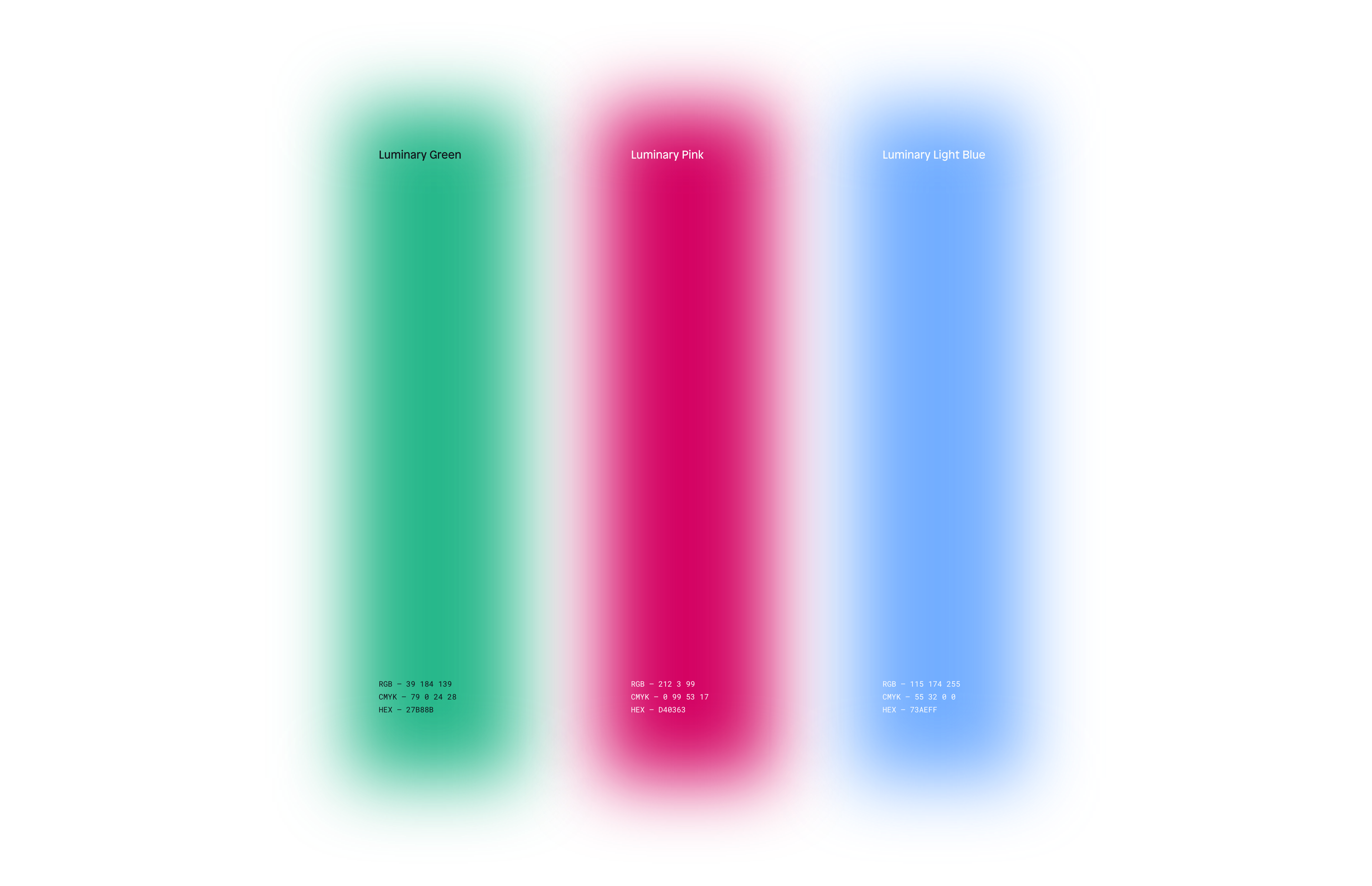
Company ҉ Luminary
Luminary2022IL
Overview
The Luminary brand needed a refresh – brand equity was lacking, and while the company hurdled staffing changes, much of the original branding had been nearly wiped away.
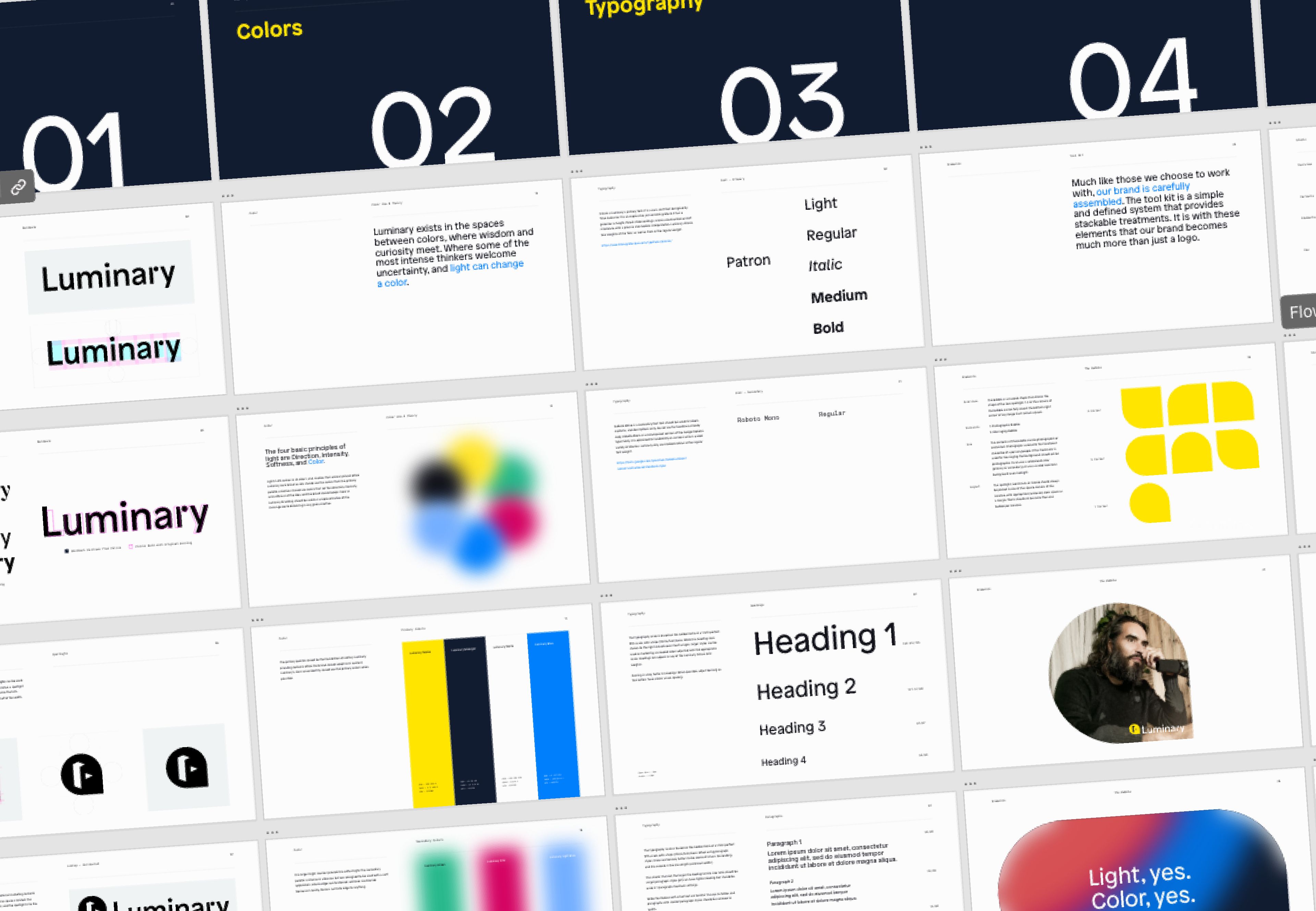
Soon after joining, it was clear that the design team would need some guidelines to lean up against to uphold quality and consistency in the brand.

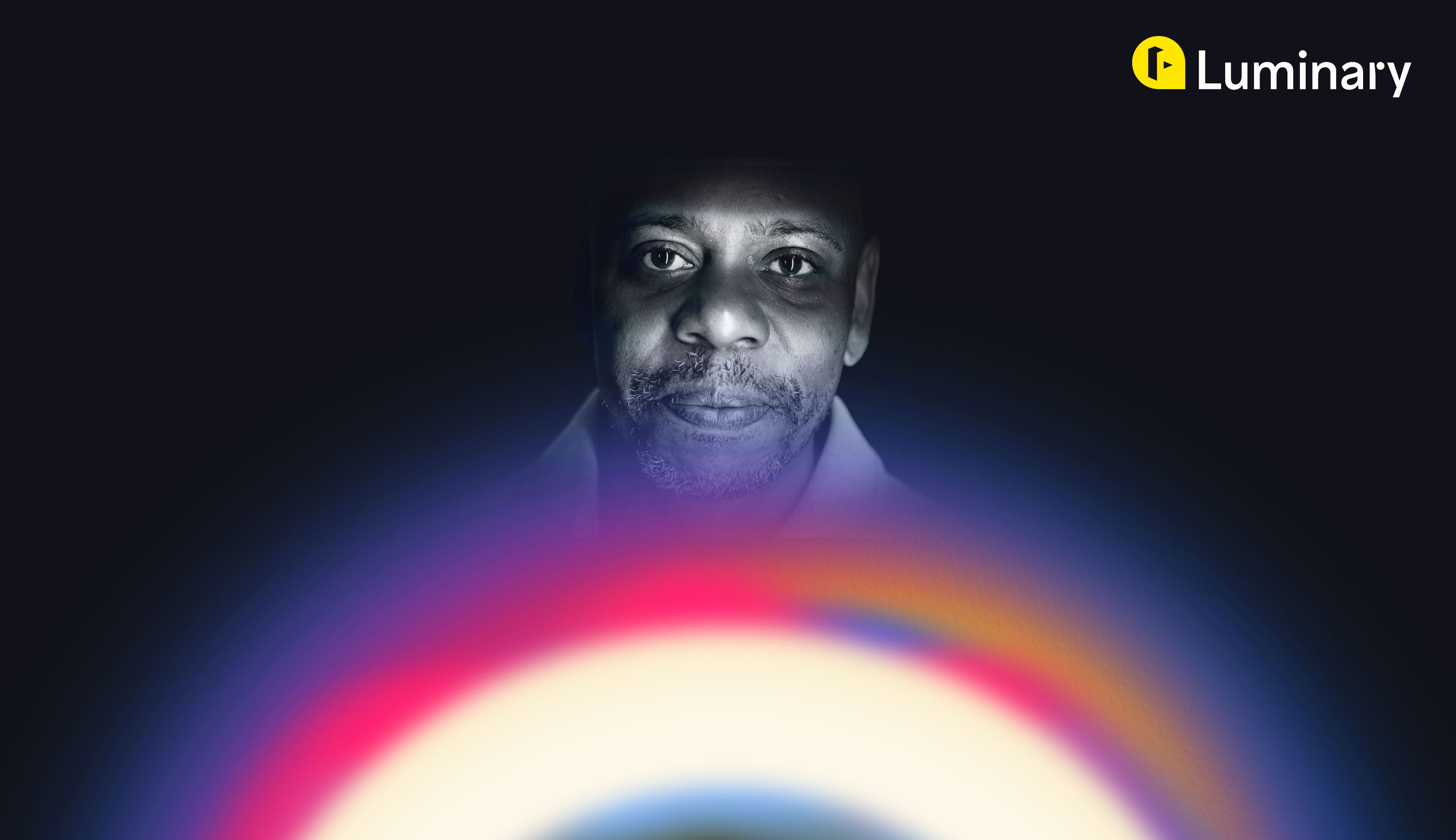
Concept –– Hear in a new light.
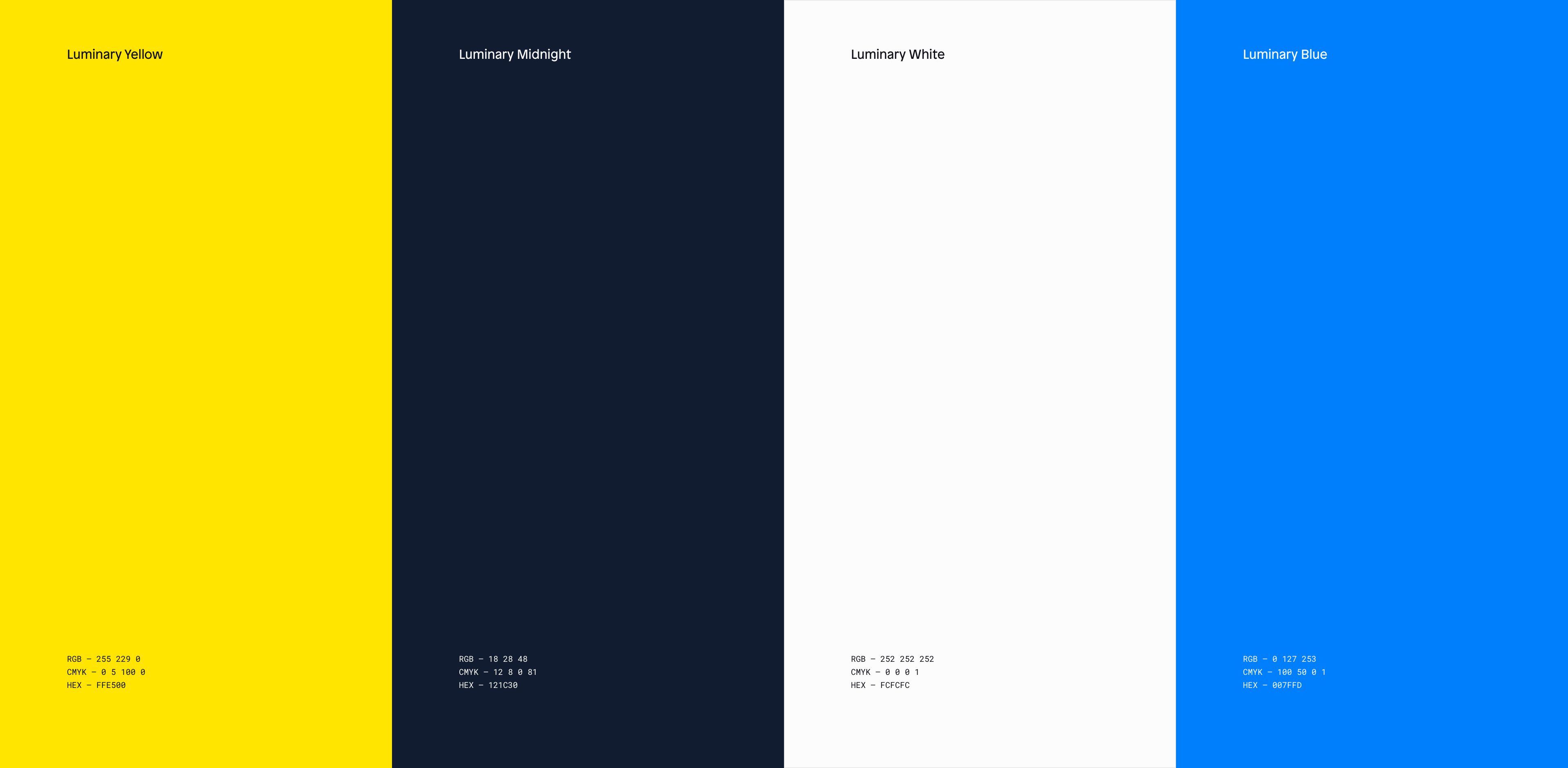
Luminary exists in the spaces between colors, where wisdom and curiosity meet. Where some of the most intense thinkers welcome uncertainty, and light can change color.
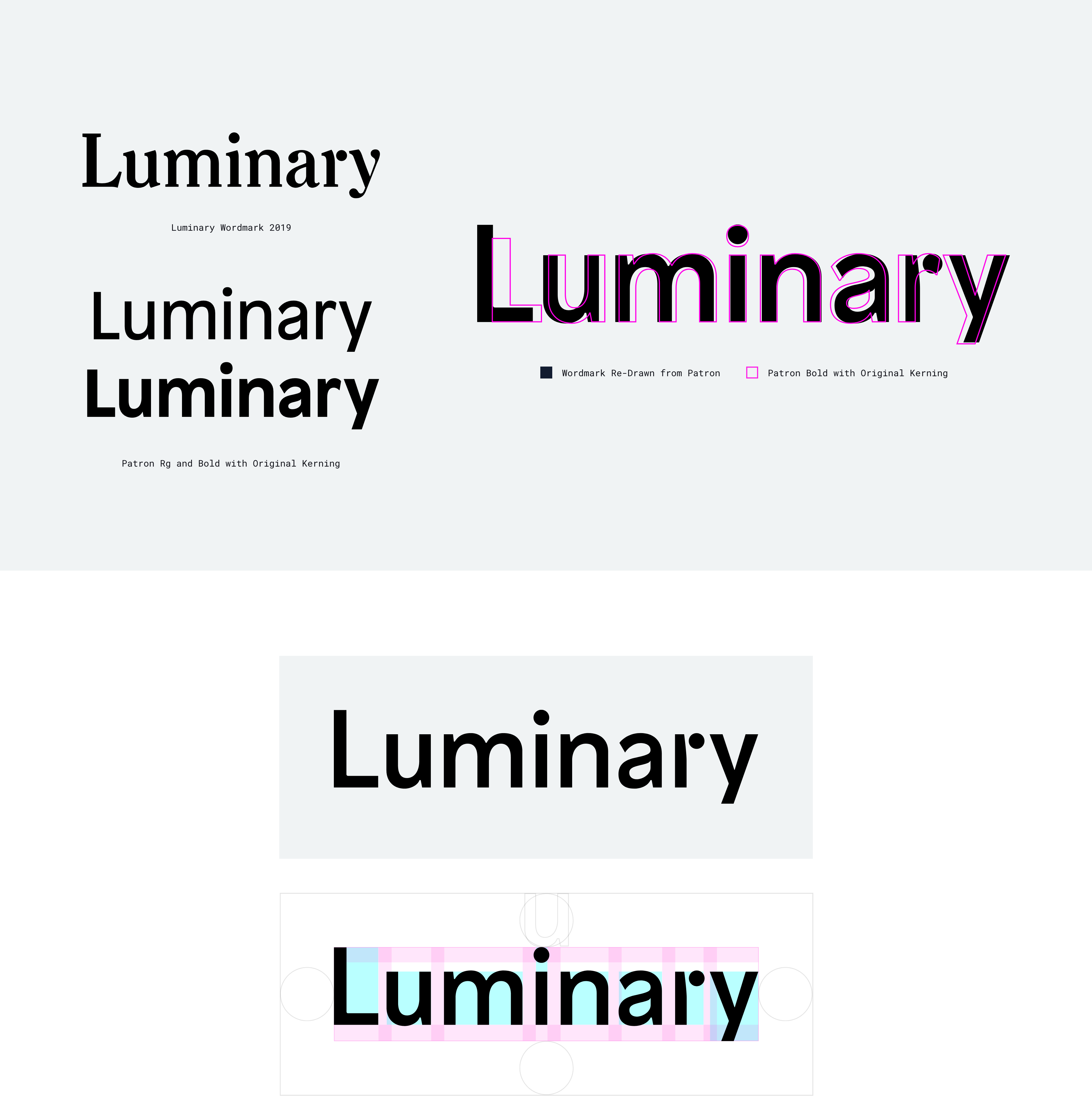
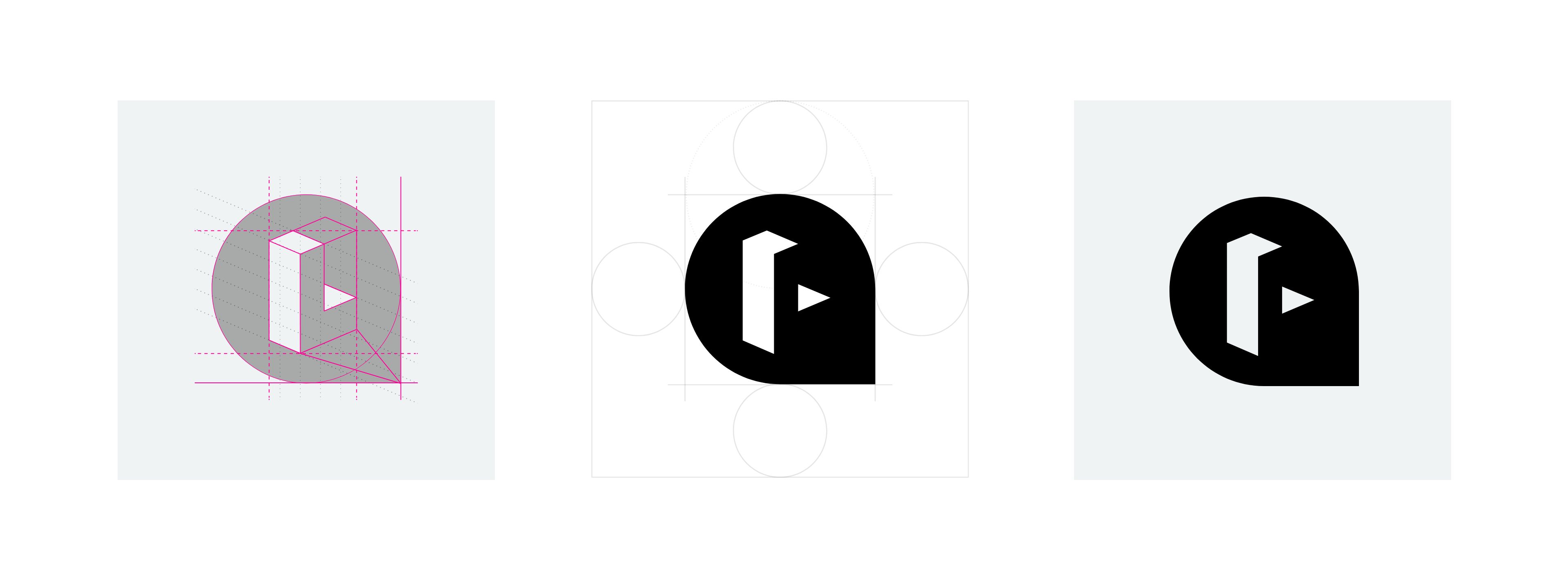
The word mark was re-drawn from the newly defined brand font, Patron. The simpler sans-serif mark is legible at mostly any scale, and retains some of the original identifiers.
The icon was derived from a combination of elements – a spotlight, a speech bubble, and an “L”.
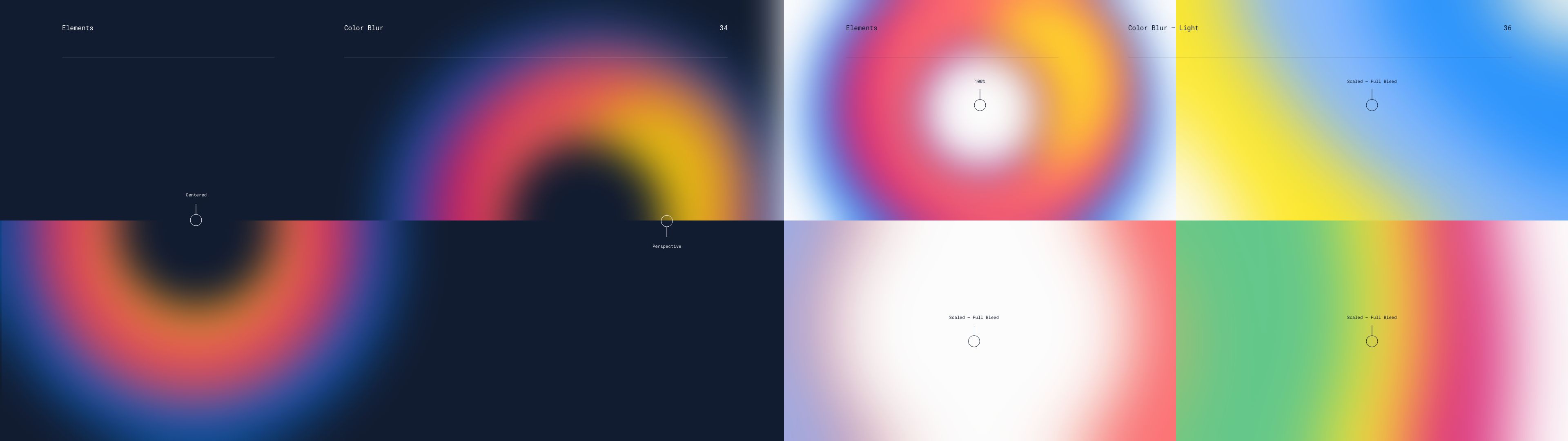
The two main elements of the design system revolve around the two definitions of Luminary. A light – this is our talent, and a blur, which is the other side of the light. That’s us – Luminary.